How to spot misleading graphs before you trust the headline
A chart can use correct numbers and still leave the wrong impression. Start by checking what its shapes represent, then test the sentence the chart asks you to believe.
Keep practising how to read a claim
We make Cadence. Explore short daily courses built around your goal, with lessons and practice you can return to. Start with the data-literacy course if that matches what you want to learn.
Learning Cadence editorial, , 7 min readHow we work
A presentation shows two bars. The second looks twice as tall, and the headline says demand has surged. Before you repeat that claim, read the labels: 80 orders and 90 orders. The values increased by 10, or 12.5%. The picture may be showing only the tops of the bars.
Below are original, fictional examples you can check with a calculator. They are teaching examples, not Cadence customer data or findings from a study. The aim is to make one careful interpretation, not to assume that everyone who draws an awkward chart is trying to deceive you.
The short answer
Read the values before judging the picture.
Check the measure and units, the scale, the time window, the denominator and the original source. Bars should show their full length from zero. A cropped line-chart axis can be useful, so inspect its labels rather than rejecting every non-zero axis. Then calculate the comparison in ordinary words.
A reading routine
Five checks before you share a graph.
Use these questions on a slide, a news graphic or a dashboard. If a necessary detail is missing, name it instead of guessing.
01
Name the measure
Read both axis labels, the unit and the title. Is the graph counting orders, people, dollars or a percentage? Write a sentence such as: This compares monthly orders at one fictional shop. If you cannot write that sentence, you do not yet know what is being compared.
02
Inspect the scale
Read the first and last tick marks, not just the shape. Are the steps equal? Are the panels using the same range? A logarithmic scale shows multiplicative changes rather than equal numerical increments. It needs to be labelled and understood before you compare slopes.
03
Check the chosen window
Look for the start date, end date and missing periods. Ask whether the headline would hold over a longer relevant window. Do not replace a conveniently chosen short window with an equally convenient long one: choose the period that matches the question.
04
Find the denominator
For a rate, ask out of how many. For a count, ask whether the population or opportunity changed. More delayed deliveries can coexist with a lower delay rate when total deliveries increase. These are different questions, so ask to see both if both matter.
05
Follow the source
Open the original table or report where available. Check that its dates, population and measure match the chart. Look for corrections and uncertainty. If the source is missing, say that you cannot verify the claim; the attractive design does not supply the missing evidence.
Example 1
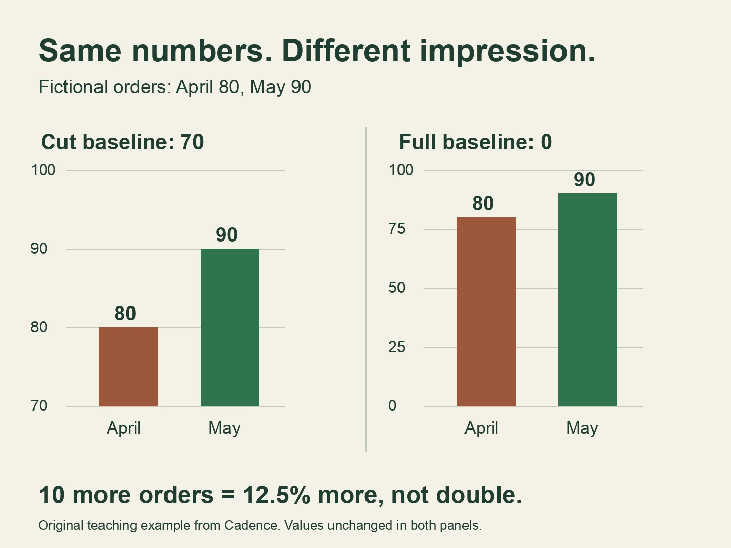
Two bar charts, one 12.5% increase.
The illustration uses 80 orders in April and 90 in May. In the first panel, the axis begins at 70. The visible bar lengths are therefore 10 and 20 units, so May looks twice as large. In the second panel, both bars start at zero and keep their actual 80-to-90 relationship.
The arithmetic never changes: 90 minus 80 is 10 more orders. Divide 10 by the starting 80 to get 0.125, or 12.5%. A careful caption is: Orders rose from 80 in April to 90 in May, an increase of 10 orders (12.5%). It does not say demand doubled.
ONS recommends a zero baseline when bar length or filled area encodes the value. That rule protects the comparison the shape invites you to make. It does not tell you whether a 12.5% change is important: you still need the business context and other periods.
A line chart does not always need to start at zero.
ONS allows a cropped axis for line charts and scatter plots when it makes the relevant variation clearer. Read the numerical scale and the intended question. A small fluctuation can matter even when it occupies a narrow part of the total range.
Imagine a room-temperature line that moves from 20 to 21 degrees. An axis from 19 to 22 can make that one-degree change easy to inspect. It does not mean the room became several times hotter. A full-range view and a closer view can both be useful when labelled honestly. The test is whether the caption describes the numbers accurately, not whether the line looks dramatic.
More late deliveries, a smaller late-delivery rate.
A fictional delivery service reports 10 late deliveries out of 100 in April, then 15 out of 300 in May. A chart of late-delivery counts rises from 10 to 15. That is five more late deliveries, a 50% increase in the count. A customer experiencing a delay is still experiencing a delay.
But the late-delivery rate falls from 10/100 = 10% to 15/300 = 5%. That is a fall of five percentage points, or a 50% relative reduction in the rate. Neither chart is automatically false. The misleading step would be using the count alone to claim that a delivery became more likely to arrive late.
Ask which question you need answered. Planning support workload may require the count. Comparing reliability across different volumes requires the rate and a consistent definition of late. This tiny example does not establish a lasting improvement or its cause.
Example 3
A rising week inside a falling month.
A fictional library records weekly visits of 120, 90, 70 and 80. Show only the last two weeks and visits rose by about 14.3%. Compare the first and last weeks and visits fell by about 33.3%. Both calculations are correct. Neither describes every movement in the month.
A useful sentence preserves both facts: Visits recovered from 70 to 80 in the final week, but remained below the first week's 120. Before explaining why, check opening days, holidays and whether the same counting method was used. Four observations are too little to establish a seasonal pattern.
When you ask for more context, explain the decision it will help. For staffing next week, recent opening hours may matter. For an annual budget, one selected week will not answer the whole question.
Another visual trap
Two lines can match because their axes were chosen to match.
A chart with a left scale and a right scale can make unrelated quantities rise together. ONS demonstrates how changing the two ranges can alter the apparent relationship and recommends considering separate charts instead.
Before accepting a claim based on two overlapping lines, identify the unit for each one and inspect each series separately. Even a real association does not establish a cause. Our linked correlation-and-causation guide explores that separate question.
These exercises test the examples on this page. They are not a validated assessment of statistical ability. Write your answer before continuing.
A bar chart begins at 95 and shows scores of 96 and 98. The second visible bar is three times as long. Did the score triple?
A club receives 12 complaints from 200 visits in one month and 18 complaints from 600 visits in the next. What happened to the count and the complaints-per-visit rate?
A line chart begins at 48 and shows values from 49 to 51. Is the non-zero axis enough to prove the chart is misleading?
Answer check
Show the comparison, not just the verdict.
1. No. The score rose by 2, from 96 to 98, about 2.08% relative to 96. The visible lengths above 95 are 1 and 3, which explains the visual tripling. Restoring the bar baseline to zero fixes that length comparison.
2. The count rose by six complaints, or 50%. The complaints-per-visit rate fell from 12/200 = 6% to 18/600 = 3%, a reduction of three percentage points. Keep the unit as complaints per visit: it is not a percentage of people unless you know how complaints and visits map to distinct people.
3. No. A cropped line axis can help show variation. Check the labels, the numerical change and the caption. Calling the change enormous without context could mislead; simply showing a close view does not establish that.
Take it into a real conversation
Ask for one missing piece without accusing the presenter.
Try: I can see the increase in the count. Could we also show it as a rate, using the same denominator in both periods? Or: Could we see the full bar scale and the values before deciding how large this change is?
For a public chart, keep a short private record: the claim, what the chart actually measures, the comparison you calculated and what remains unknown. You can disagree with a headline without claiming to know the author's intention. A sensible outcome is sometimes: this chart does not answer the question yet.
Where we fit
Make your next goal a question you can answer.
Cadence is our app. Its Data literacy for non-analysts course covers reading workplace metrics, questioning evidence and explaining uncertainty. The course page shows what it covers before you decide whether to start. This article is free to use on its own and does not require an account.
A concrete learning goal could be: I want to explain what a chart does and does not show before using it in a decision. Use a public or fictional example when practising. Completing a course does not certify an analysis, and Cadence is not a substitute for a statistician when a decision requires specialist methods.
We make Cadence. Explore short daily courses built around your goal, with lessons and practice you can return to. Start with the data-literacy course if that matches what you want to learn.
Questions
Common questions.
What makes a graph misleading?
Its visual impression or accompanying claim can go beyond what the data supports. Check the measure, scale, time window, denominator and source. A graph may contain correct numbers but invite an inaccurate comparison.
Must every graph start at zero?
No. Bars should start at zero because their length represents the value. A clearly labelled line chart or scatter plot can use a narrower range to reveal variation. Read the values and the question before judging the choice.
Can both a count and a rate be correct?
Yes. Fifteen late deliveries out of 300 is a larger count but a lower rate than ten out of 100. Show the measure that answers your question and include the other when it changes the interpretation.
Does a misleading graph prove someone is lying?
No. A poor visual choice may be an error or an attempt to emphasise one aspect. Identify the misleading comparison and ask for the missing context without assuming the author's intention.
We make Cadence. Explore short daily courses built around your goal, with lessons and practice you can return to. Start with the data-literacy course if that matches what you want to learn.